What is a fresh start without a fresh look?
When I started spitballing ideas for how I wanted to reshape and redirect my business offerings as a coach, I contemplated whether I wanted to stick with my brand – She Lives Fit – or abandon completely and rename as well as redesign the image. Back in 2011, I went through a series of possible business names, focused on fitness, wellness, health, alliteration plays with “Whit Wellness,” “Fit Whit” and many more… but I landed on “She Lives Fit” after realizing I wanted to focus on she – not me. Also, I loved the idea of “fit” as much more encompassing than exercise. “Fit” meant living in a way that “meets your purpose” – that “fits” for you. In my coaching, I have always focused on “fitting MORE” healthy, positive things into your life, to naturally make less space for the things that are less “fitful” for you.
Of course, “living fit” can also mean living in a way that is physically active, mindful of your health, and prioritizing your wellness in a way that results in ultimate “fitness.”
So back to relaunching: I decided I didn’t want to part with the name I’ve bonded with and held onto throughout the years. But I did want to refocus the tagline and direction.
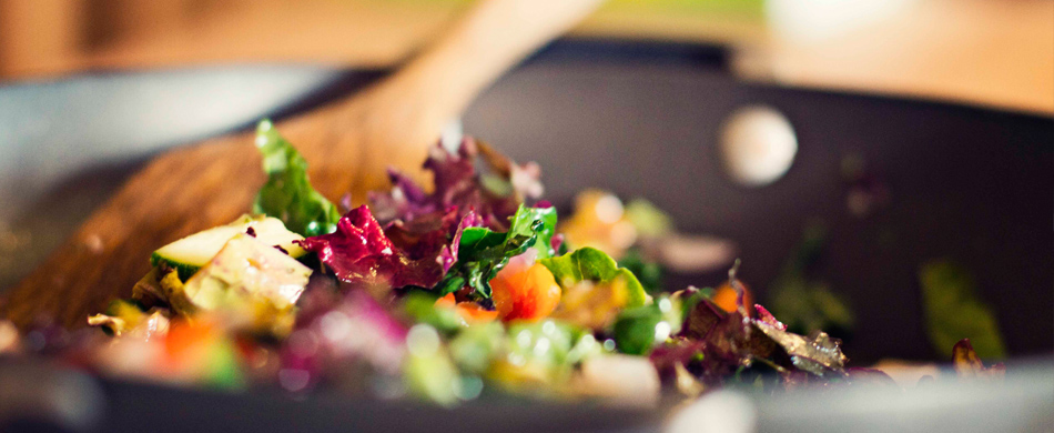
She Lives Fit: Plant Powered Coaching.
Fitting healthy food and ethical choices into your family life.
When my original logo was conceptualized, I did it myself with an outdated version of Creative Suite, back in 2011 in a time of different design aesthetics. I was young, fresh in the world of health coaching and wellness, and didn’t really have a full concept of what I would find as my niche. My logo was bright, youthful, bouncy, girly, and incorporated an element of a female form “leaping” into a new life.
Rethinking my approach this time, and reflecting on how my own life has transitioned and evolved over the last decade, I wanted some help from an expert in the design field. So I contacted my brilliantly talented best friend and graphic designer, Katie Sterner, to help me out with the project.
We talked about my vision… incorporating plants, organic movement, growth, transition, maturity and sleek line elements into the concept. She helped flesh out the brand to several options (all beautifully done) and we settled on the one I’ve debuted today.
The emblem is meant to evoke a feeling of forward movement, direction, and organic leaf-like form, with a dawning/horizon abstract element in the circle rising above. The font is classic, clean, mature, and relatable as adults who appreciate form and structure. The tagline, “Plant Powered Coaching” is meant to encompass the direction I take in giving YOU the power to reclaim your health through plants. You get to decide what that looks like. It doesn’t need to be the same for everyone, and it doesn’t need to conform to a set definition of “vegan,” “vegetarian,” “whole-food-plant-based” or any set diet out there.
Let’s determine how to fit plants into your life, in a way that is empowering, enriching, and sustainable.
I hope you love the new look as much as I do! I wanted to share my journey of rebranding and relaunching with you all to give a better view of what I plan to do here, and how my business mantra and passion is evolving.
Are you curious about what I could offer for your life and goals? I hope you’ll reach out. I can chat quickly on the phone for 15 minutes, or we can set a coffee date and get into more detail. Either way, I’m here to listen.
Let’s plant some seeds to move you into your right fit.
In your best health,
Whit